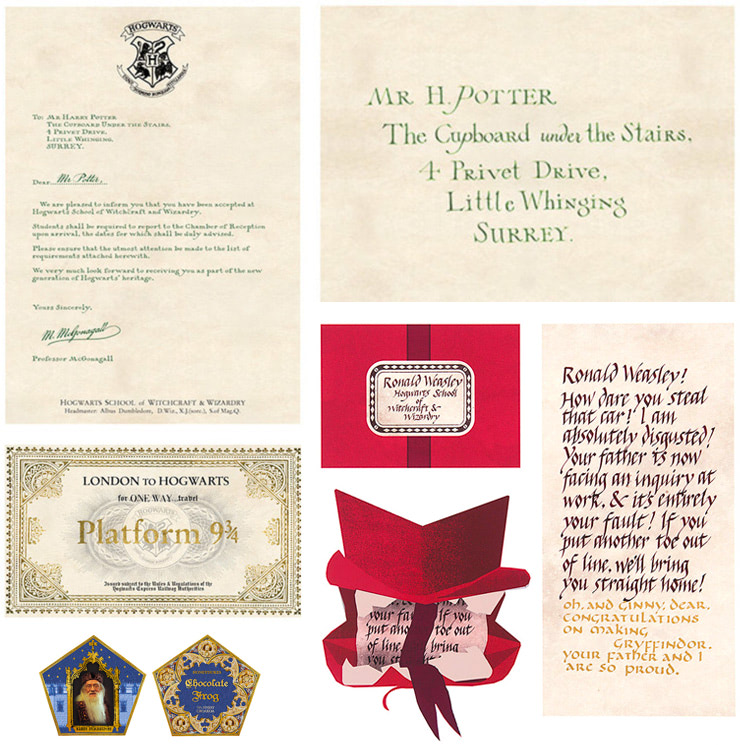
One of graphic artist Miraphora Mina’s first contributions to the Wizarding World was the design of an envelope. That envelope was emblazoned with ornate lettering in green ink and began with the now-famous words: ‘Mr H Potter, The Cupboard under the Stairs’.
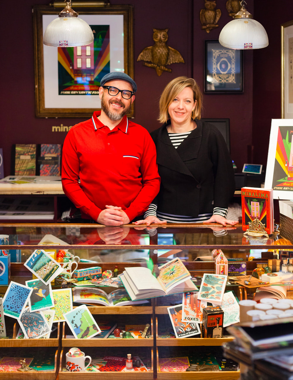
Nearly twenty years later, as Mira and I wrap up our chat from her studio in London, she jokes, ‘I’m going to be Professor McGonagall when we finish.’ Mira’s creating a custom version of that now iconic Hogwarts entrance letter; a coveted collectible for a super ‘Potter’ fan. She’s the only Muggle (non-magic person) authorised to replicate the film prop and jokingly adds, ‘it’s not my handwriting; it’s me concentrating.’
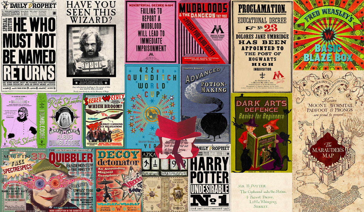
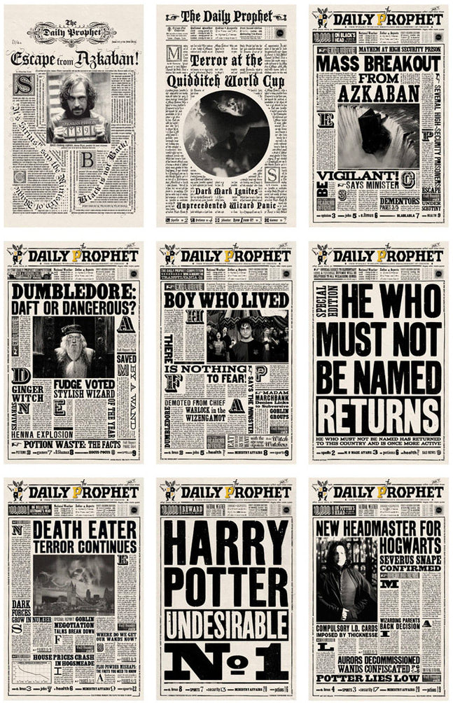
Miraphora and design partner Eduardo Lima are the suitably magical portmanteau MinaLima. The design duo met on the set of Chamber of Secrets — the second of eight ‘Potter’ films — in 2002. Together, they’re the artists responsible for every piece of graphic design in the ‘Potter’ cinematic universe (that’s the Harry Potter films and, to date, two Fantastic Beasts prequels). Their work encompasses everything from textbooks to tapestries and posters to packaging. Some of that design work is crucial to visual storytelling (think the Daily Prophet newspapers), while much lives in the background — combinations of colour, texture and typography that help bring authenticity, realism and style to Harry’s fictional world.
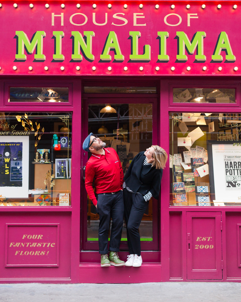
In 2016, Miraphora and Eduardo opened the House of MinaLima. Their pop-up-gallery-turned-permanent-exhibition in London’s Soho area is a celebration and showcase of their hundreds of unique Wizarding World props. The popularity of the gallery (and accompanying online shop) is a testament to the strength, personality and enduring legacy of the graphic design in the Harry Potter films. While the ‘Potter’ films were a revolving stage of behind-the-camera personnel, the graphic design remained a striking visual constant that evolved wonderfully over ten years on film.
‘It’s a bit like handwriting … you don’t really notice that you’re doing it’
Miraphora studied Theatre Design at London’s Central Saint Martins School of Art. She graduated in 1987 and joined the Harry Potter and the Philosopher’s Stone production team — led by director Christopher Columbus — in 2001. Eduardo studied Visual Communications at Rio’s Pontificia Universidade Catolica, graduating in 1997. Their enduring graphic partnership was formalised as studio MinaLima in 2009, the same year the penultimate Harry Potter book was adapted for screen.
What’s interesting about the Harry Potter films is that they presented a unique and exciting opportunity that is atypical of much graphic design for film. While graphic design work for film is largely background (‘you might be just helping shape that world’), the ‘Potter’ films gave Miraphora and Eduardo the opportunity to create both the look and feel of the Wizarding World as well as the signature pieces and props (‘the things you might see in an actor’s hands’) that live inside it. MinaLima had the monumental task of painting both broad brushstrokes and intricate detail; taking J.K. Rowling’s incredibly descriptive words and giving them actual graphic form on screen.
As such, the team used those first Harry Potter films to establish a design vocabulary and a graphical language which would evolve as the eight-film saga became increasingly darker and J.K. Rowling’s Wizarding World exponentially larger. Signature graphical elements in Philosopher’s Stone like the Daily Prophet newspapers, Hogwarts letters and various pieces of Wizarding World signage and insignia were the formative design pieces which helped establish the team’s sizeable graphical palette. That graphical style expanded greatly over the following decade and remained visually cohesive (‘it’s a bit like handwriting … you don’t really notice that you’re doing it’) despite four directors presenting the Boy Wizard’s story from their own unique cinematic perspectives.
‘Taking a reality and shifting it just a few degrees’
While the ‘Potter’ films are set in a secret magical universe operating in parallel to our Muggle world (‘I shouldn’t say that, it’s a real world,’ jokes Mira), MinaLima felt their design choices needed to reference a reality that the audience would understand and accept. Yes, wizards ride brooms and play Quidditch, but a map is a map, a newspaper is a newspaper and a letter is a letter. ‘It’s about the audience taking ownership of what we offered them,’ explains Mira. While the Daily Prophet could have been ‘orange with scalloped edges and green type’, it had to feel grounded in our real-world. Mira describes their interpretation of Rowling’s work as ‘taking a reality and shifting it just a few degrees into this fictional space.’ Everything is anchored in a reality, ‘even though it’s a bit weird when you look deeper.’
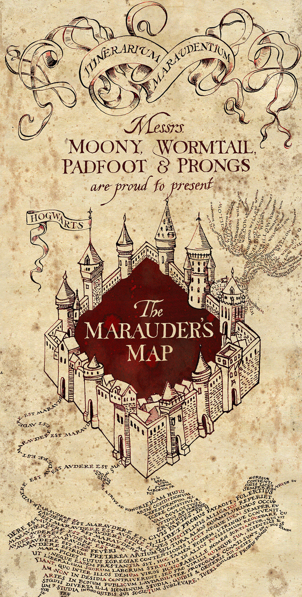
Miraphora and Eduardo’s involvement begins months before shooting starts, during a lofty pre-production phase (consequently, breaks between ‘Potter’ films would often last only a few months). They’d read the script and identify the hero props; those graphical elements central to a scene and crucial to driving the narrative. And while those hero pieces might be the most exciting (and potentially challenging) design elements, the team would try and give ‘the same love and attention’ to everything. ‘It’s kind of our ethos to spread the love right across even the tiniest details … there’s just as much detail in a wand label or a memory vial label as there will be in the Marauder’s Map or Daily Prophet.’
For MinaLima, the design process for an object begins, almost universally, with visual reference. Although the ‘Potter’ films are set in the present day (Rowling canon has the story taking place between 1991 and 1998), the duo inform themselves visually by referencing ‘different periods according to different kind of requirements of the story.’ They’ve accumulated drawers full of visual ephemera over the years (Mira shows me a fascinating reference book about the history of American typography and points to a gloriously stylised letter ‘b’) and find that type, printing technique, colour, texture and shape all help to inspire and ‘trigger the thought process.’
‘It’s how it makes you feel rather than a kind of scientific logic’
For the Daily Prophet newspapers, MinaLima created an identity (they hesitate to use the word ‘brand’) for the organisation that would evolve with the narrative. The paper is ‘quite whimsical in the first couple of films’ before the Prophet comes under the control of the Ministry of Magic and operates as a propaganda publication from Order of the Phoenix (2007) onwards. The team looked to political propaganda from Russian Constructivist design of the 1920s and the newspaper’s masthead was redesigned ‘to feel like it had that personality.’ Explains Mira: ‘it’s how it makes you feel rather than a kind of scientific logic.’
In Prisoner of Azkaban (2004), Harry inherits the Marauder’s Map — a detailed magical map of Hogwarts school that plots the location and movements of the castle’s inhabitants. The prop plays a crucial narrative role in this third story and appears repeatedly across the following five films. Mira looked to 17th century map illustrations for inspiration and found, in particular, examples of animals constructed from hand lettering. ‘I thought, “wow that could be quite something that a Marauder would employ to communicate”.’ For MinaLima, it’s about getting inside a character’s head and thinking about their motivations and the methods in which they might communicate. What might their handwriting look like? How polished or professional would their design feel? How might they construct a map?
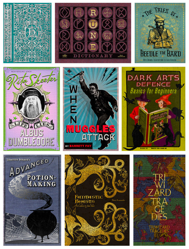
When the loathsome Dolores Umbridge becomes Hogwarts’ Defence Against the Dark Arts teacher during the events of Order of the Phoenix, she removes practical magic from the curriculum in favour of a patronisingly theoretical approach to spellwork. For textbook inspiration, MinaLima looked at 1940s and 1950s children’s story books. ‘We know Umbridge is trying to demean these children, giving them material that’s way below their age.’ In response, their design work needed to be ‘very instantly recognisable as being completely inappropriate for their age.’
‘We created loads of material and you don’t see any of it … it’s cinders’
Some of MinaLima’s most involved and time-consuming contributions are actually the sum of hundreds of smaller graphic elements. For the four-story Weasley joke shop in Half-Blood Prince (2009), the team spent nearly six months designing hundreds of bits of packaging to bulk out the shop. ‘We would go and buy funny old bits of Chinese food packaging and adapt them … there were hundreds of products that had to be designed and made and everything was manufactured in-house.’ They embodied the Weasley twins in their design thinking (‘if you could even call it design … they would probably just throw it together’) so that the store felt like the authentic brainchild of two eager and entrepreneurial teenage wizards.
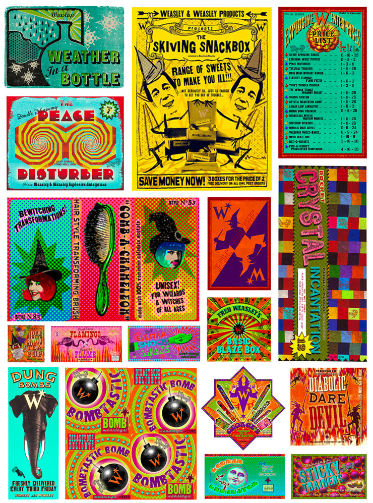
For the Quidditch World Cup sequence in Goblet of Fire (2005), the team designed hordes of programs, posters, tickets and memorabilia — it had to feel like a proper sporting event. ‘As graphic designers we have to think about that whole world,’ says Mira. At the end of the match, Voldemort’s followers set fire to the stadium campground, and the makeshift venue is obliterated. ‘We created loads of material and you don’t see any of it … it’s cinders.’ Between them, the joke shop and World Cup set pieces, though grandiose in scale (and, undoubtedly, budget), have a combined screen time of just minutes.
That sheer volume of graphic design in the ‘Potter’ films, coupled with the fact that everything feels like it’s given such individual love and consideration, is why these projects make such interesting case studies. For every copy of The Quibbler magazine there’s an interesting blink-and-you’d-miss-it letter or leaflet. For every giant newspaper headline or Ministry ‘wanted’ poster there’s an equally detailed piece of incidental packaging or signage. As a collective body of work they bring another level of realism and colour to J.K. Rowling’s already visceral and immersive universe.
‘The literal cut and paste’
As the ‘Potter’ films progressed, so too did the physical design process. The early 21st century saw mammoth leaps in visual effects technology, and advances in software like Adobe’s Photoshop and Illustrator — as well as the processing power of computers — greatly expanded the graphic design toolkit (and, presumably, the pace at which one could work, iterate and undo). For Philosopher’s Stone, ‘we used to just cut things out, stick them down and then photocopy them and Tippex out the edges.’ Mira holds up an oversized novelty pair of scissors and jokes about those early days (‘the literal cut and paste’). She adds, ‘I learnt Photoshop because of Harry Potter and I’m not sure I would have done at such a rapid pace had I not been just thrown in.’
The extent to which bespoke graphical elements were incorporated into the films changed over time too. On those early films, the team might buy an existing textbook, wrap it with custom-designed artwork and create fifteen or so pages of thematically relevant illustration and copy. On set, an actor would inevitably flip to some un-designed placeholder page and the illusion was broken. ‘From that moment we’d take those fifteen pages, repeat them all the way through the book, even if it cost more.’ (Mira adds that, anecdotally, actors have commented on that level of immersion in the universe contributing to their performance.)
And while technological advances might enable new tools and techniques, there are advantages to traditional methodologies. For typography, the team prefer scanning reference ephemera, rather than using vectored live type. Explains Mira: ‘you can buy a lot of fonts now that are nicely crafted from the period … but there’s nothing like scanning those because they have little nuances and irregularities that you get in the period.’ (Interestingly, the team did create a digital typeface from Mira’s Marauder’s Map lettering which was used to build Prisoner of Azkaban’s wonderful end credit sequence.)
‘We need 500 labels by tomorrow’
During production, Miraphora and Eduardo work from a space in the art department at Hertfordshire’s Leavesden Studios, the WW2 aircraft-hanger-turned-film-studio where all eight Harry Potter films were shot. It allows them to visit the sound stages and see their work in the context of a dressed set. ‘If it’s extremely important then sometimes we’ll even do a camera test,’ explains Mira. ‘With big closeups [like the Marauder’s Map] we would run a camera test to just check that things were legible and the colours were okay and didn’t bounce.’
Having access to the set also means that the duo are on-call if there’s an eleventh hour graphics request. In an ideal world, the team work on a single graphic project — whether that be a particular prop or scene — and see it through to completion. In reality, Miraphora and Eduardo are often working concurrently on multiple props with varying deadlines. Says Mira, ‘you’re usually juggling a few different things at one time … suddenly you’ll get a request from the set going, “we need 500 labels by tomorrow!” and there’s a big closeup.’ ‘Sometimes they’re like, “we can’t read this, can you do it again?”’ she adds. ‘It’s the reality of being a designer.’
And while some of the ‘Potter’ directors were less concerned about the contribution of graphics (‘they would really just say yes to everything … it was up to us to keep going’), others had strong design visions. Alfonso Cuarón, the one-time ‘Potter’ director who brought us the wonderfully stylistic Prisoner of Azkaban, ‘really cared about all the visual pointers.’ Admits Mira, ‘he’s the only one I’m going to confess made me cry. I was up all night doing changes. But the things that he asked for made the thing better.’
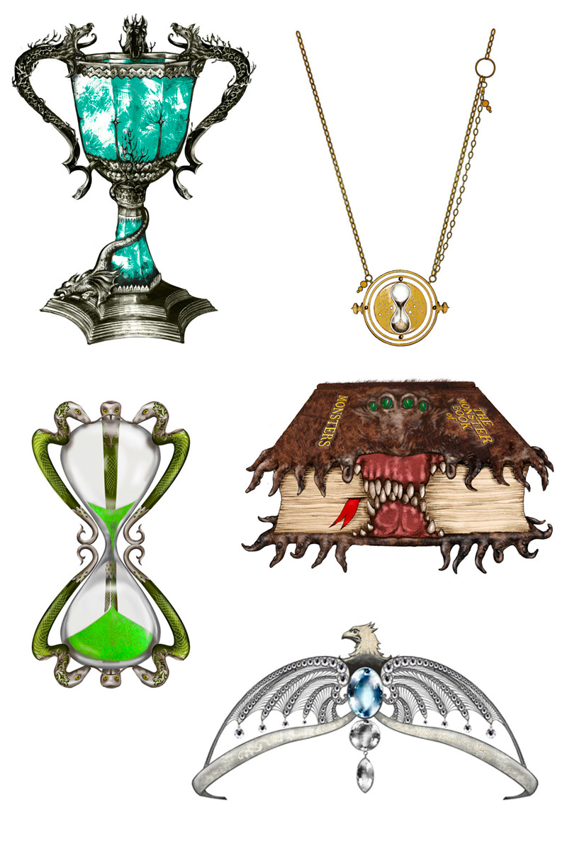
Sometimes the team’s contributions will stretch beyond what might be traditionally considered graphic design. By fortune, Mira found herself designing the Horcruxes, magical treasures enchanted by Lord Voldemort to conceal portions of his soul. On designing Ravenclaw’s lost diadem, Mira explains: ‘for some reason, no one could agree on what it should look like. It does feel a bit like it’s design by committee … if you’re going to work in a team then you have to be willing to let go of that.’ Conversely, there’s real satisfaction when something they’ve designed is given an immediate thumbs up by the director, or, in some cases, author J.K. Rowling herself.
‘I’d quite like to spend a week in here doing work experience’
While the film script identifies the hero props and might broadly describe a particular scene, there’s often a level of backstory and detail (particularly for background elements) that the team need to either source or, in some cases, invent. The seven ‘Potter’ books are one resource, providing an additional layer of exposition to help inform design decisions and fill in story blanks (‘I’m reading this for work,’ jokes Mira). Another invaluable source is J.K. Rowling herself.
When MinaLima needed additional information for the Sirius Black family tree tapestry, Rowling expanded her universe and provided the team with new names and connections, allowing them to accurately complete the wall-sized prop. ‘We often ask her for suggestions,’ says Mira. Smiling, she adds, ‘once she comes into our studio we’re like, “sit down, don’t go, we need this, this and this”.’ ‘She did joke on the last film, “I’d quite like to spend a week in here doing work experience”. Can you imagine?’
During one such visit, the team were designing fictitious textbooks for Hermione Granger and Rowling picked up one of the titles the team had invented. Remembers Mira: ‘it was something to do with rune translation — it was before we knew about Beedle the Bard [from book seven]— she picked it up and went, “this is going to be really useful for where this is going”.’ True to form, Rowling always guarded her Wizarding World secrets. ‘Even on the last film she was picking things up in our office [and saying], “oh this will be useful … but I can’t [tell you more]”.’
‘It’s everywhere, being imitated, mimicked, loved — it’s a real honour’
Although it’s been nearly a decade since production wrapped on the final ‘Potter’ film, MinaLima’s Harry Potter journey continues to grow. Their graphic design contributions are spreading across the globe with Universal’s Harry Potter theme parks, as well as a pop-up gallery in Osaka. Excitedly, Eduardo tells me that one of their first gallery sales was to a fan in Australia. On film, the team are continuing their Wizarding World work with the Fantastic Beasts prequels and are awaiting a call to start on the third instalment — set in Eduardo’s native Brazil — any day now.
‘It’s very unusual to be involved with a project where you could go in as a trainee and come out as a professional with a really good understanding of your craft.’ In the first chapter of the first Harry Potter book Professor McGonagall remarks that Harry’s name will be known throughout the world. ‘It’s ironic [J.K. Rowling] put that in the fiction and it turned into a reality,’ says Mira. ‘I was just doing a job really, responding on that day to a request … it’s a privilege to know that we’ve contributed to some kind of popular culture.’
‘It’s everywhere, being imitated, mimicked, loved — it’s a real honour.’
***
MinaLima’s Harry Potter journey doesn’t end there! Continue with part two of our exclusive profile of the design duo as we go behind-the-scenes of Newt Scamander’s Fantastic Beasts prequel series.
Want to see more of MinaLima’s amazing designs? Visit their online gallery and store to explore and purchase Harry Potter and Fantastic Beasts props. Fans in the UK can visit the House of MinaLima gallery at 26 Greek Street, Soho, London between 12pm-7pm every day.